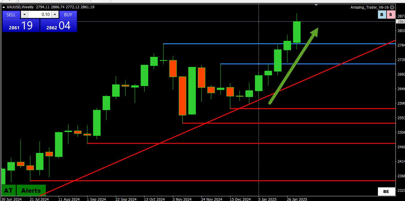
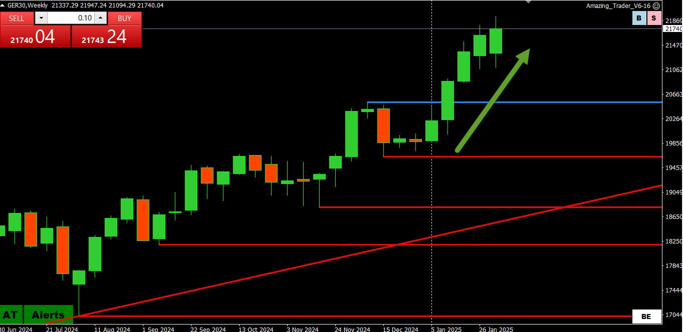
I was just scanning my chartss and here is one that stands out so a 2nd one for this week
. XAUUSD WEEKLY CHART
9 green UP candles in a row and record highs each week, including the startt of this week. Betting on a retracement following through will remain a low probability bet until/unless this pattern is broken..
USDJPY 150.91 broken => move down came within 5 pips of 149.34 support => bounce paused below 150.91 => failure setup the next move down through 149.34
Trading Tip: The bounce and failure to break 150.91 shook out the weak shorts so when USDJPY made a fresh run at the downside there was less ability to absorb the fresh selling as short postions had been reduced.
Trading Chart of the Week: EURUSD\4 Hour (scroll down for the Daily Chart)
I had my choice of charts to post as it is easy to look back in hindsight.
I picked out a EURUSD 4 hour chart, not because I trade that time frame but use it to help identify what side to trade on shorter time frame charts.
What do you notice in this chart in a week that was filled with news headlines that caused whipsaw spikes (up and down) on both sides. It wasn’t until later Thursday that upward momentum (i.e. rising red lines) took over.
The red lines are from my Amazing Trader (AT) charting algo and are like ladders, in this case, building to the upside. Only if the most recent red line that preceded a new high is broken, downside is limited and risk is still pointed up.
The strategy is explained and illustrated in the AT trading guide that comes along with a subscription. You can try to apply the same logic yourself but a lot better using AT as the pattern repeats in all time frames and with any instrument you broker has on its MT4 platform
I am always on the lookout for patterns and what would extend them and what would end them. The longer the time frame the stronger the pattern, especially when there is a trend, which should give a clue for shorter-term traders what is the strong side of the marlet.
Both the DAX and XAUUSD have similar patterns, each has 5 up (green)( candles (6 for XAUUSD including Dec) and record highs since the start iof the year.
Watch the low/high for the coming week tk see if this pattern is broken, is broken, or takes a pause Iinside week).


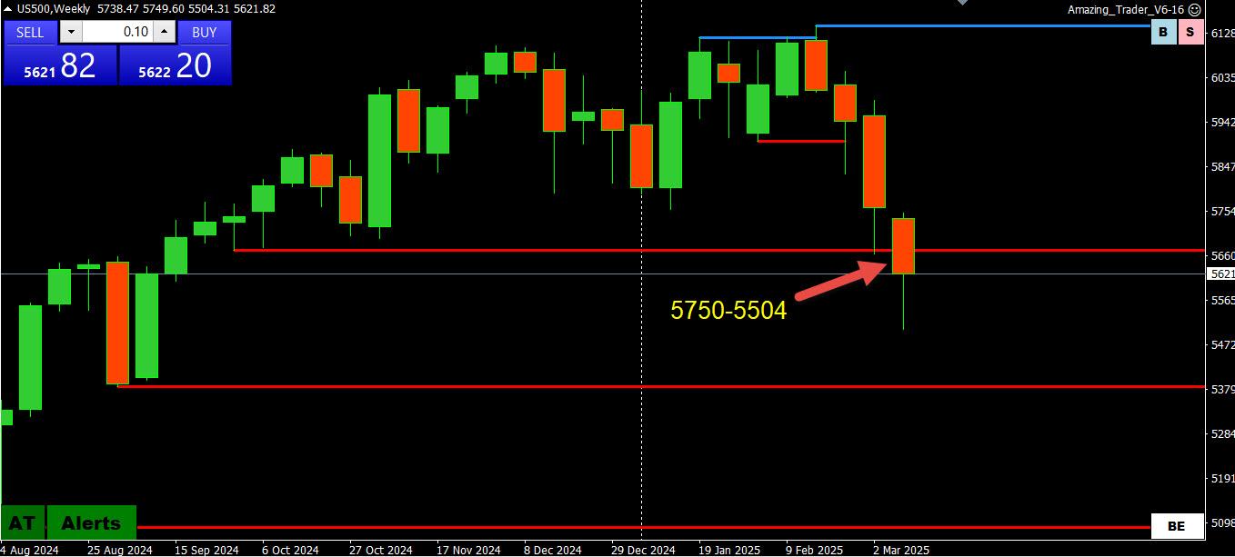
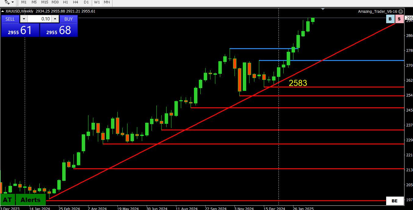 .
.